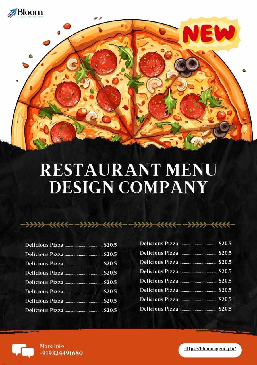
A restaurant’s success is influenced not just by the quality of its food but by how effectively that food is presented to customers. One of the most powerful yet underutilized tools in the dining experience is the menu itself. A thoughtfully structured and visually appealing menu card design can do more than list dishes—it can enhance appetite, guide customer choices, and ultimately increase sales.
In this blog, we’ll explore how creative menu layouts, guided by design psychology and branding, can transform a simple menu into a strategic sales tool.
1. The Power of the Golden Triangle
Studies in menu psychology show that when a customer first opens a menu, their eyes tend to move in a specific pattern—starting at the top center, then moving to the top right, and finally to the top left. This is referred to as the "Golden Triangle."
To make the most of this pattern, place high-margin or signature dishes within this zone. A strategic menu card design that aligns with this visual behavior can subtly direct customers toward the items you want to promote.
2. Two-Column Layouts for Clarity
One of the most widely used and effective formats is the two-column layout. This structure allows for clear separation between the name of the dish and its description or pricing. It also helps customers process information faster.
When paired with clear headings for each section (e.g., Starters, Mains, Desserts), this layout reduces confusion and improves navigation. A clean, well-spaced two-column menu is especially effective in fine dining or high-volume restaurants.
3. Section-Based Highlighting
Dividing your menu into well-defined sections helps customers locate what they’re looking for without getting overwhelmed. Use spacing, colored boxes, or subtle dividers to separate categories. Some restaurants also use borders or shading to draw attention to specific sections like "Chef's Picks" or "Most Popular."
This layout style encourages exploration, especially if each section offers a small but carefully curated list. It also aligns with modern menu card design practices that prioritize usability and flow.
4. Boxed Features for Upselling
If you have high-profit items or customer favorites, consider boxing them in a different color or frame. This visual anchor draws attention and communicates that the item is special or recommended. Use this technique sparingly—too many boxes can clutter the menu and confuse the customer.
Incorporating boxed features into your menu card design not only helps boost sales of specific dishes but also adds aesthetic balance to the layout.
5. Grid Layouts for Cafés and Casual Dining
For cafés, brunch spots, or modern eateries, grid-style menu layouts are gaining popularity. In this format, items are displayed in small modular blocks with minimal descriptions and possibly small icons or photos.
Grid layouts are visually engaging and suitable for environments where fast decisions are made. When designed well, they can boost appetite by creating a sense of abundance and variety, making the menu feel vibrant and energetic.
6. Integrated Visuals and Icons
While not every menu needs full photographs, using small icons—such as symbols for spicy dishes, vegetarian options, or chef recommendations—can help improve readability and accessibility. Icons help guide the eye, reinforce meaning, and make the menu more interactive.
A modern menu card design should balance visual elements with text, using symbols and images not just for decoration but as functional design tools.
7. Single-Page vs Multi-Page Layouts
The structure of your menu should depend on the size and complexity of your offerings:
Single-page menus are ideal for short, curated selections. They are easy to navigate and reduce decision fatigue.
Multi-page menus are better for larger menus, allowing more detailed descriptions and organization.
Regardless of the length, maintaining a consistent layout style across all pages is critical for creating a seamless customer experience.
8. Typography-First Layouts
In typography-focused layouts, the design leans on the power of fonts to create hierarchy and appeal. By using different type weights, sizes, and styles, you can draw attention to section headings, item names, or descriptions.
This type of menu card design is especially effective in upscale restaurants or boutique eateries where simplicity and elegance are key. Typography-first menus tend to look clean, timeless, and professional.
9. Asymmetrical and Experimental Designs
To create a truly memorable impression, some restaurants are experimenting with asymmetrical layouts or non-linear menu flows. These designs can include angled text blocks, layered visual elements, or overlapping categories.
Though riskier and harder to execute, creative layouts like these can help reinforce your restaurant's unique identity. When aligned with strong branding, unconventional menu card design becomes a conversation starter and a marketing asset.
10. Seasonal or Rotating Menu Sections
Create a layout with a flexible section dedicated to rotating dishes or seasonal specials. This keeps your menu fresh and dynamic, encouraging repeat visits. A modular layout where one section can be updated frequently—either digitally or with inserts—is ideal.
From a sales perspective, featuring seasonal or limited-time offers in their own space gives them urgency and special attention.
Final Thoughts
A menu is not just a utility—it’s an extension of your brand and a key driver of your restaurant’s revenue. By incorporating creative menu layouts into your menu card design, you can influence what customers order, boost high-margin sales, and improve overall satisfaction.
Whether you prefer a minimalist approach, a vibrant grid layout, or a boxed-feature strategy, the most effective designs are those that blend aesthetics, functionality, and psychology.
Craft a menu that doesn’t just list meals—but makes every selection feel irresistible.


Write a comment ...